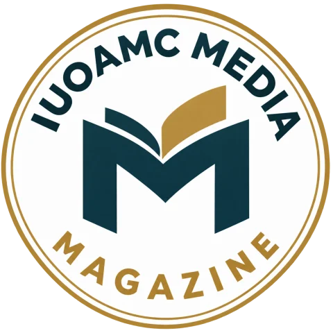
Institutional interpretation
Meaning of the symbols
The letter M
Refers to Media and Magazine; its unfolding-page construction connects reading, editing and publishing.
The gold page
Represents selection, review and care for the content delivered to readers.
Circle and name
Unites the symbol and magazine name in one identity across platforms, cards and appointment documents.
Identity colours
Navy for the symbol and lettering, gold for the frame and highlighted page, white for reading space and clarity.
Where the emblem appears
Appears on the magazine, coverage, team cards and appointment documents. The magazine is affiliated with IUOAMC TV and has an editorial pathway separate from the research journal.
Preserving the identity
Keep the complete emblem intact, without stretching or cropping, with clear space and sufficient contrast for the name. Use the approved artwork for the intended medium and check a physical proof before production.
The Media Magazine is a publication of IUOAMC TV, issued by INTERNATIONAL UNION OF ARAB MASTER CHEFS LTD. Channel trade mark application reference: UK IPO UK00004435018, Classes 38 and 41.